I was given this awesome Jillibean Soup 12x12 placemat to
work with. You could cut it down because it is perforated or you could even use it as photo strips. I almost cut it down but then decided kept the way it is, I could use each individual square to decorate and/or include a photo of everyone from vacation. There were 10 of us total.
I used the So Noted patterned papers and stickers by Carta Bella. I decorated each square individually but also left some sort of simple so it wasn't too distracting or overwhelming to the eye. I love how this page turned out.
A few weeks ago, I shared another page using THIS Jillibean Soup placemat. This time, I used it as a mask with some misting.
Thanks for stopping by today! Visit my blog for more details about my page.
Showing posts with label Ashley. Show all posts
Thursday, April 24, 2014
Monday, April 14, 2014
Inspiration Station: Carta Bella!
Hello everyone! I'm back with an inspiration post today featuring Carta Bella's So Noted patterned papers and sticker sheet. If you're unfamiliar with these papers, you can view them in the store HERE. The specific pattern papers I used are: Dear Jane, Script & Scribbles, Note Cards, and Always You.
Here were my inspiration pieces:
I especially loved the Jimmy Buffett quote (even though there is no doubt about Heaven for me). In the second inspiration piece, what I really liked was the splash of orange at the top and the bottom. So with those pieces, are you ready to see what I came up with?
If you're unfamiliar with these Carta Bella papers, they are thick and textured. You can view larger photos of the patterns on the Carta Bella website HERE. I also have a couple of close up shots so you can see the layers, patterns, and stickers.
I hope you can find some inspiration in my pieces this week. Hope to see you share your work in the LCOM gallery. For more details about my page, be sure to stop by my blog today.
Here were my inspiration pieces:
![]() |
| via |
![]() |
| via |
If you're unfamiliar with these Carta Bella papers, they are thick and textured. You can view larger photos of the patterns on the Carta Bella website HERE. I also have a couple of close up shots so you can see the layers, patterns, and stickers.
I hope you can find some inspiration in my pieces this week. Hope to see you share your work in the LCOM gallery. For more details about my page, be sure to stop by my blog today.
Thursday, April 3, 2014
Product Shuffle: mixing alphabet fonts in your title
Today we're going to talk about mixing alphabet fonts for your title. If you're like me, you probably have tons of alphabet sticker sheets. Mixing fonts on your page is a great way to use up your stash! You can combine different colors, different fonts, big letters, small letters... the possibilities are endless. Combining different alphabet stickers can add a lot of character to your page and help put emphasis on certain words.
Here's a new page I created for you:
I used three different alphabet sticker sets on this page: EK Success (small white), American Crafts (grey), and Amy Tangerine (Thickers). Maybe you don't feel comfortable mixing so many sizes and colors just quite yet. That's ok! Here's one I did a little while back using two colors and two different fonts.
Making a quick trip through the LCOM Gallery, I found some other examples of how members have mixed alphabets. Here's one by Gisele. She used three different fonts and three different colors.
One from Probyte. I like the script font combined with the more bold font. Both colors in her title match her layout perfectly.
And one more from Isabelle. She incorporated a sticker into her title + two other fonts in two colors.
Browse through the gallery and find your own inspiration! Use these examples as a starting point. We hope we've given you a creative push to dig into your stash and use up some of those alpha stickers!
Here's a new page I created for you:
I used three different alphabet sticker sets on this page: EK Success (small white), American Crafts (grey), and Amy Tangerine (Thickers). Maybe you don't feel comfortable mixing so many sizes and colors just quite yet. That's ok! Here's one I did a little while back using two colors and two different fonts.
Making a quick trip through the LCOM Gallery, I found some other examples of how members have mixed alphabets. Here's one by Gisele. She used three different fonts and three different colors.
![]() | |||||||
| via |
![]() |
| via |
![]() |
| via |
Monday, March 24, 2014
Inspiration Station
Hi guys! I'm back this month with a second inspiration station! This time I found a layout by the great Janna Werner in the Elle's Studio gallery. I loved the white space on her page. Here it is:
I used the Serendipity collection from Elle's Studio. THIS is the patterned paper I chose. It's flipped on its side and trimmed to 8.5x11 size. I also had the Serendipity circle tags and tabs. Even though I chose to scrap my page in a smaller size, I still kept the design pretty similar to Janna's original.
The cut outs at the bottom of my page are also from Elle's Studio. They're from the Saltwater cut out sheet. You can see I've layered the Serendipity tabs and circle tag behind my photo. I added strips of washi tape to the top and bottom of the page and cork heart stickers and enamel dots to finish the page. You can view my blog for the story behind my page; this is an Instagram shot from last year taken on a trail run near our home.
Hopefully you find inspiration from my post today. Please share your creations in the LCOM gallery!
![]() |
| via |
The cut outs at the bottom of my page are also from Elle's Studio. They're from the Saltwater cut out sheet. You can see I've layered the Serendipity tabs and circle tag behind my photo. I added strips of washi tape to the top and bottom of the page and cork heart stickers and enamel dots to finish the page. You can view my blog for the story behind my page; this is an Instagram shot from last year taken on a trail run near our home.
Hopefully you find inspiration from my post today. Please share your creations in the LCOM gallery!
Thursday, March 20, 2014
Product Shuffle: Cardstock Only
Happy Spring! I don't know about you guys, but I am sure ready for some warmer spring weather!
Today I have a cardstock only layout to share with you. This was tough for me because I normally use only patterned papers in my scrapbooks. I use them for the backgrounds and for matting and other accents on my page. For this page, I was given several sheets of Core'dinations cardstock. If you're not familiar with this cardstock, let me tell you about it. It's really awesome. This cardstock does not have a white core. This cardstock is colored all the way through! It has a canvas texture on one side and is smooth on the other side.
The colors I used on my layout are: Exotic Orchid, Aqueduct, and Black Magic - Hex. Let me tell you about this black magic Core'dinations collection. The cardstock is black and the core is a pretty bright color (like pink).
What makes the colored core so great is that you can distress this cardstock to let the core show. Sand it, tear it, score it, and edge distress it.
Enough talking. Here's my layout.
I sanded the black cardstock so the pink core could show through. It looks really cool. I also used a distressing edger tool. There is a page of videos on the Core'dinations website with several techniques.
As far as a cardstock only layout, it turns out there are many ways to spice up your page. I used a Studio Calico mask and two colors of Heidi Swapp Color Shine (mustard and primrose) on the background. I used my punches to add some heart accents and border strips. I also stamped on some cardstock, fussy cut the shapes, and added them to my page.
I hope this has provided some inspiration for you! I'd love to see you upload your pages to the LCOM gallery.

Today I have a cardstock only layout to share with you. This was tough for me because I normally use only patterned papers in my scrapbooks. I use them for the backgrounds and for matting and other accents on my page. For this page, I was given several sheets of Core'dinations cardstock. If you're not familiar with this cardstock, let me tell you about it. It's really awesome. This cardstock does not have a white core. This cardstock is colored all the way through! It has a canvas texture on one side and is smooth on the other side.
The colors I used on my layout are: Exotic Orchid, Aqueduct, and Black Magic - Hex. Let me tell you about this black magic Core'dinations collection. The cardstock is black and the core is a pretty bright color (like pink).
What makes the colored core so great is that you can distress this cardstock to let the core show. Sand it, tear it, score it, and edge distress it.
Enough talking. Here's my layout.
I sanded the black cardstock so the pink core could show through. It looks really cool. I also used a distressing edger tool. There is a page of videos on the Core'dinations website with several techniques.
As far as a cardstock only layout, it turns out there are many ways to spice up your page. I used a Studio Calico mask and two colors of Heidi Swapp Color Shine (mustard and primrose) on the background. I used my punches to add some heart accents and border strips. I also stamped on some cardstock, fussy cut the shapes, and added them to my page.
I hope this has provided some inspiration for you! I'd love to see you upload your pages to the LCOM gallery.
Monday, March 3, 2014
Inspiration Station
Happy Monday ladies! I have the first March Inspiration Monday post.
While shopping online, I came across this photo and I was really drawn to the blue and white contrast + the metallic purse. Such a pretty shade of blue - it reminded me of the ocean. Which was great because I was just vacationing in the Bahamas!
I thought I would try for a blue/white/gold color scheme on my layout. Since it's another vacation photo, I added in some accent colors that are colorful and fun (pink and yellow).
Isabelle had me use the Elle's Studio Serendipity line + the Crate Paper DIY line and these two collections go together really well! Plus I am a huge fan of anything Elle's Studio.
The flower pattern on THIS paper from the Serendipity collection is something I would never use but that blue/white B side is great for my inspiration photo. I also had the Serendipity circle tags and the Serendipity Large & Medium journal tags. I layered these on my page.
My embellishments are from the Crate Paper DIY Shop layered stickers + accent stickers. I did think these embellishments coordinated quite well for the most part but I wanted the gold tags to match a little better. I just removed the top sticker from the tag and replaced it with a different accent sticker. I also wanted to use the blue flower from the flower cluster so I just cut it and used it alone on my page. Enough talking... Here's my page:
I hope you've been inspired by this photo and use it to create a project. I'd love it if you uploaded to our LCOM gallery and linked it in the comments here on this post so I can see it!
Thanks so much for stopping by today and for more details about my page, visit my blog!
While shopping online, I came across this photo and I was really drawn to the blue and white contrast + the metallic purse. Such a pretty shade of blue - it reminded me of the ocean. Which was great because I was just vacationing in the Bahamas!
I thought I would try for a blue/white/gold color scheme on my layout. Since it's another vacation photo, I added in some accent colors that are colorful and fun (pink and yellow).
![]() |
| via |
Isabelle had me use the Elle's Studio Serendipity line + the Crate Paper DIY line and these two collections go together really well! Plus I am a huge fan of anything Elle's Studio.
The flower pattern on THIS paper from the Serendipity collection is something I would never use but that blue/white B side is great for my inspiration photo. I also had the Serendipity circle tags and the Serendipity Large & Medium journal tags. I layered these on my page.
My embellishments are from the Crate Paper DIY Shop layered stickers + accent stickers. I did think these embellishments coordinated quite well for the most part but I wanted the gold tags to match a little better. I just removed the top sticker from the tag and replaced it with a different accent sticker. I also wanted to use the blue flower from the flower cluster so I just cut it and used it alone on my page. Enough talking... Here's my page:
I hope you've been inspired by this photo and use it to create a project. I'd love it if you uploaded to our LCOM gallery and linked it in the comments here on this post so I can see it!
Thanks so much for stopping by today and for more details about my page, visit my blog!
Thursday, February 20, 2014
Product Shuffle: Altered Journal Tags!
Hey guys!! Today I've got my altered journal tag project to share for our product shuffle. I got the Elle's Studio You and Me note tags and large journaling tags. These little tags are the cutest things ever! Love them.
So I had a few projects in mind for these babies. First, I don't do project life or pocket style scrapbooking but I knew these would be so cute for that kind of thing (if you're into that kind of thing). BUT I do sometimes use these little journal cards and tags on my regular scrapbook pages. So that was another idea. Lastly, I thought about making a little mini album with some journaling on the back and maybe a couple of photos. Since these all seemed like such excellent ideas, I never got around to completing ANY of them because I'm kind of waiting to be inspired by one of the projects specifically. So we'll see what happens there.
At any rate, I did alter the tags and I think they're really cute. Here are four that I designed:
You could use literally ANYTHING from your stash to alter your cards. I used stamps, wood veneers, die cuts, washi tape, and candy dots.
If you were into pocket style scrapbooking, here's an idea of how they could work for that:
So I had a few projects in mind for these babies. First, I don't do project life or pocket style scrapbooking but I knew these would be so cute for that kind of thing (if you're into that kind of thing). BUT I do sometimes use these little journal cards and tags on my regular scrapbook pages. So that was another idea. Lastly, I thought about making a little mini album with some journaling on the back and maybe a couple of photos. Since these all seemed like such excellent ideas, I never got around to completing ANY of them because I'm kind of waiting to be inspired by one of the projects specifically. So we'll see what happens there.
At any rate, I did alter the tags and I think they're really cute. Here are four that I designed:
You could use literally ANYTHING from your stash to alter your cards. I used stamps, wood veneers, die cuts, washi tape, and candy dots.
If you were into pocket style scrapbooking, here's an idea of how they could work for that:
I'd love to see your ideas and how you alter your own journal tags and cards. Please upload them to the LCOM gallery! Hope you enjoyed today's Product Shuffle and I'll see you soon!
Sunday, December 15, 2013
LCOM - Layout of the Month
Welcome to December's Layout of the Month!
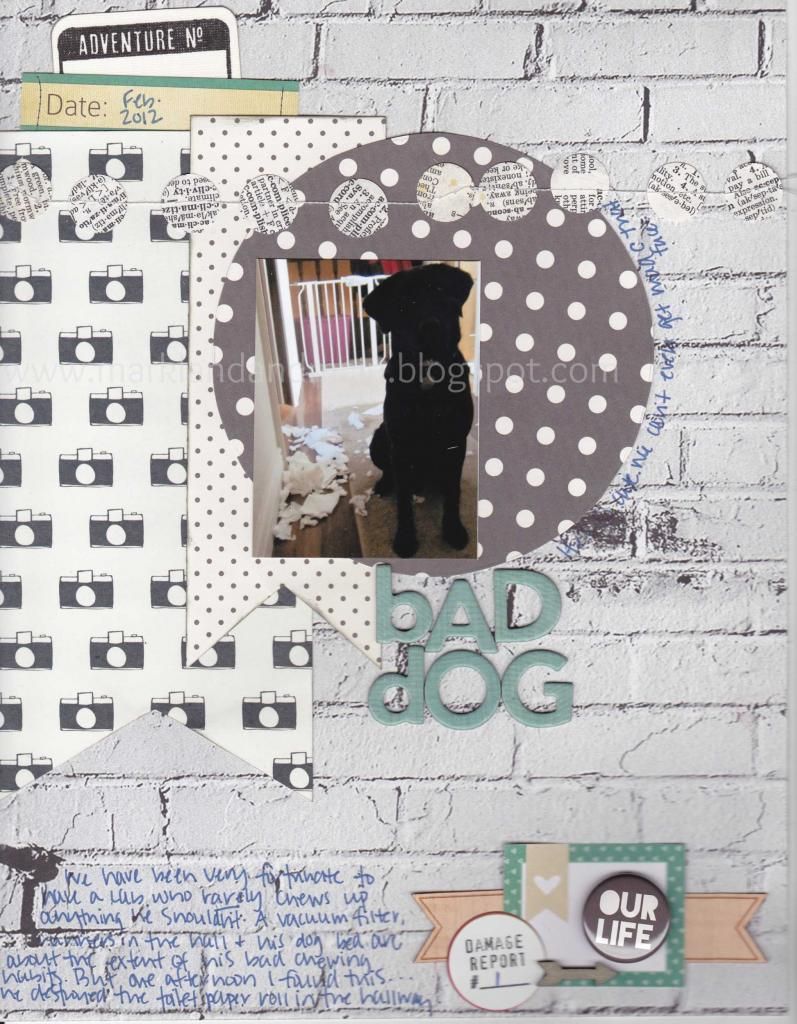
This month's layout is comes to you by member Ashley. When ever I look through the gallery for inspiration, I always stop on Ashley's projects. There's just something special about all of them. Her projects are so simple and subtle , yet they're full of texture and layers. I love her story telling and her dog is such a cutie!!
Bad Dog by Ashley
Thank you Ashley for sharing your projects with us in the gallery! If you haven't already, head on over the forum and sign up! You'll find all of Ashley's projects and so much more!
Subscribe to:
Posts (Atom)